- Magazine Dirt
- Posts
- WordGames
WordGames
How does a computer talk?

Walden Green on the typography of Artificial Intelligence.
It’s golden hour. A millennial-coded couple sit on a rooftop together in a makeshift arrangement of a step stool and cooler. Him: “It’s….really nice up here. How did you find this place?” Her: “I don’t know. I just, kinda like to come up here to be by myself. I’ve never brought anybody else—I mean, except for her.” The girl glances down, bashfully, at the strange orange and white pendant dangling from her neck.
Him: “She goes everywhere with you right?”
She nods.
“Guess I must be doing something right then.”
Her: “I guess so. We’ll see.”
A few moments of awkward silence pass between the two, the arpeggiating synthesizers that have been soundtracking their conversation slow down, until—ping! A single word appears in the center of the screen, in unpunctuated, all-lowercase serif lettering: “friend”.
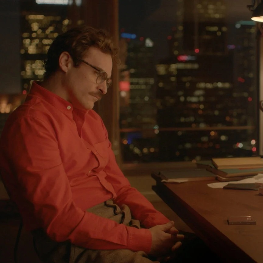
It sounds like the cold open for an episode of Black Mirror, or a gender-swapped version of the Joaquin Phoenix-Spike Jonze movie Her. Except this is a real commercial for a real product. friend was announced earlier this week—on International Friendship Day, no less—by CEO Avi Schiffman, who previously found notoriety for building the nCoV2019.live COVID tracking website and is, fun fact, about a month older than me. For all the oblique marketing, friend is pretty neatly summed up as a wearable AI companion, not unlike a tamagotchi, although I’m partial to “AI Gen Z Life Alert button.”
Page over to friend.com (Schiffman spent $1.8 million to secure the domain name) where a brief statement includes the line “friend is an expression of how lonely I've felt.” The site design leans minimalist: black and gray text on crisp white, the only color coming from screengrabs of the aforementioned reveal video. Most of the text is done in the same font as the company logo, with the slight tweak that, in the logo, the horizontal bar of the “f” is merged together with the back of the “r.”
Despite looking like a print typeface, that font, Georgia, is actually digital-native. It was designed for Microsoft in 1993 by the legendary Matthew Carter, and is the yin to the yang of Verdana, the first Microsoft sans serif screen font.
What a shrewd choice of graphic design, then, to deliver this message in a typeface that feels familiar, rather demure, and yes, even a little bit friendly.
On the friend website, the use of Georgia has a mollifying effect. The product’s premise is so obviously dystopian as to approach self-parody, not helped by an FAQ page including questions like “What does 'always listening' mean?” and “What happens when I break the device?” What do you mean when? Don’t you mean if !?!?
What a shrewd choice of graphic design, then, to deliver this message in a typeface that feels familiar, rather demure, and yes, even a little bit friendly. It’s as if to tell the consumer “Hey, I know this seems scary, but I promise you’ll be just fine.” And while friend’s visual aesthetic actually deviates from most of today’s AI companies, they’re all trying to solve the same problem: how do we make this feel new, but not too new?

A few months ago, OpenAI quietly but thoroughly redesigned its entire website. This was done with practical considerations—the need for a larger CMS, and more pages to accommodate the rollout of a wider suite of projects—but it’s also a shame, because the old site, designed in collaboration with Paris-New York based agency AREA 17, makes for the perfect case study of a public-facing AI brand.
“Public-facing” is key here. According to the online brand kit, the impetus to work with AREA 17 came when “OpenAI shifted from a research-oriented non-profit to a public-facing company with commercial products.” Each design choice made therein strikes a balance between these identities: warmly-lit naturalistic photography and generative art, earth tones side-by-side with saturated colors meant to evoke early computing. The clean, utilitarian rule lines of the site’s Research index get mussed up when mousing over each result transforms the cursor into a different pixelated collage.
Warmly-lit naturalistic photography and generative art, earth tones side-by-side with saturated colors meant to evoke early computing.
AREA 17’s font package for OpenAI followed the same pattern. You had a serif typeface (Signifier Regular) for gravitas, a sans serif (Söhne Buch) for relatability, and a second, fixed-width sans serif (Söhne Mono Buch) to mimic early computing terminal type. Signifier has been all but abandoned in the site’s most recent iteration, but Söhne Buch has stuck around.
A Söhne font isn’t cheap, either. For web, app, and advertising usage, OpenAI likely spent between around $20,000 on licenses for just Söhne Buch and Söhne Mono Buch. That may seem like pocket change for a company currently valued at $80 billion, but typographically speaking, it’s about as close as you can get to “fuck you” money.
BOT CHAT
|
ICYMI: Summer of Bibliomancy
|
|
|
|
|
|
|